 1 of 13 – Charts
2 of 13 – Charts Support
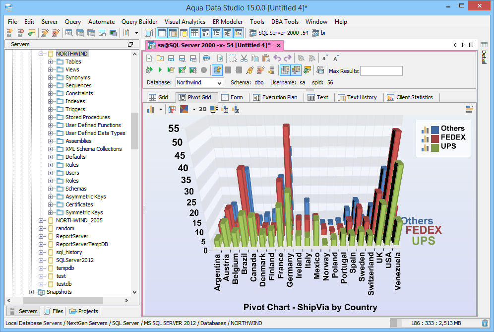
3 of 13 – Pivot Chart Types
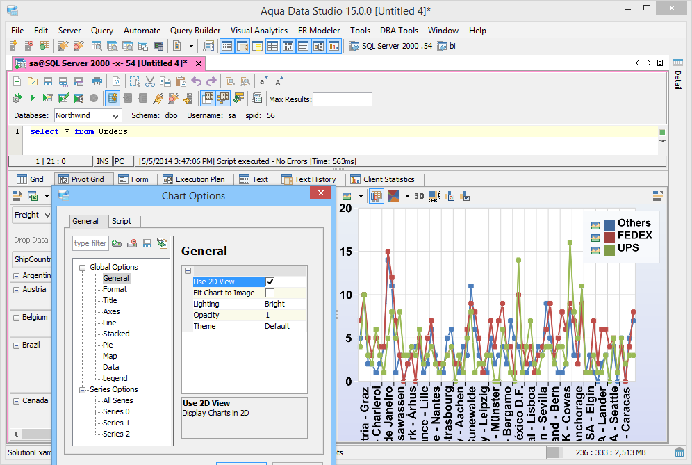
4 of 13 – Charts – Series Selection
5 of 13 – Charts – 2D Charts
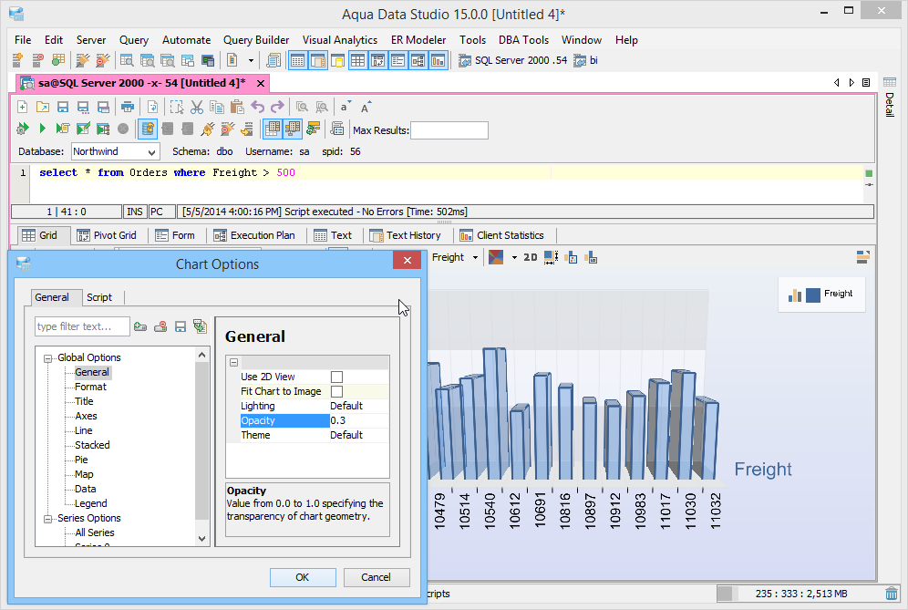
6 of 13 – Charts – Options – Opacity
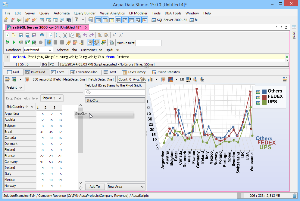
7 of 13 – Charts – Pivot – Drag Field
8 of 13 – Charts – Zoom
9 of 13 – Charts – Enhanced User Interactivity
10 of 13 – Charts – Aquacommand Script
11 of 13 – Charts – Aqua Open API
12 of 13 – Charts – Derived Function Series
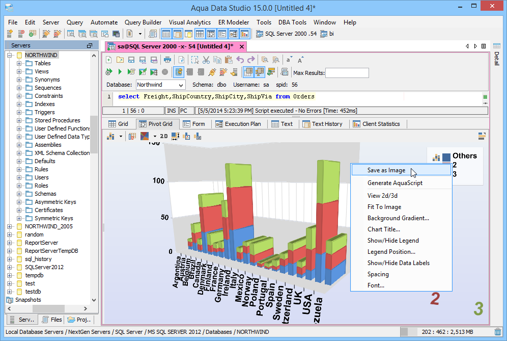
13 of 13 – Charts – Save as Image
Grid and Pivot Charts
Aqua Data Studio offers rich charting functionality, designed for better data visualization, incorporating many Excel-like features. The Charting Toolkit is available in the Grid and Pivot Grid Results tabs. With a rich set of Chart Options available and flexible features to select Chart types, Category, Series and Views, users can create reports that communicate information effectively. Pivot Tables, Aggregate and Statistical functions, Sorting, Quick Filter and other features provide the ability to customize and visualize the data more efficiently. Other unique extensibility features of Aqua Data Studio’s charts are scripting support and Open APIs for chart development.
Aqua Data Studio charting capabilities include:
Execute Queries and Generate Charts
Execute SQL queries in the SQL Editor and customize charts in Grid and Pivot Grid Results tabs. The Aqua Data Studio Charting Toolkit allows users to create professional designs for reporting purposes. You can enable charts in the SQL Editor using File->Options->General->Chart->Support Charts.
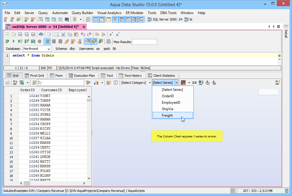
Series and Category
Charting functionality in Aqua Data Studio is organized into Series, Category and Values. To define a chart you need to select at least one series and category from the list of columns in the resultset. The data in your chart is grouped by category. Values determine the size/height of your chart.
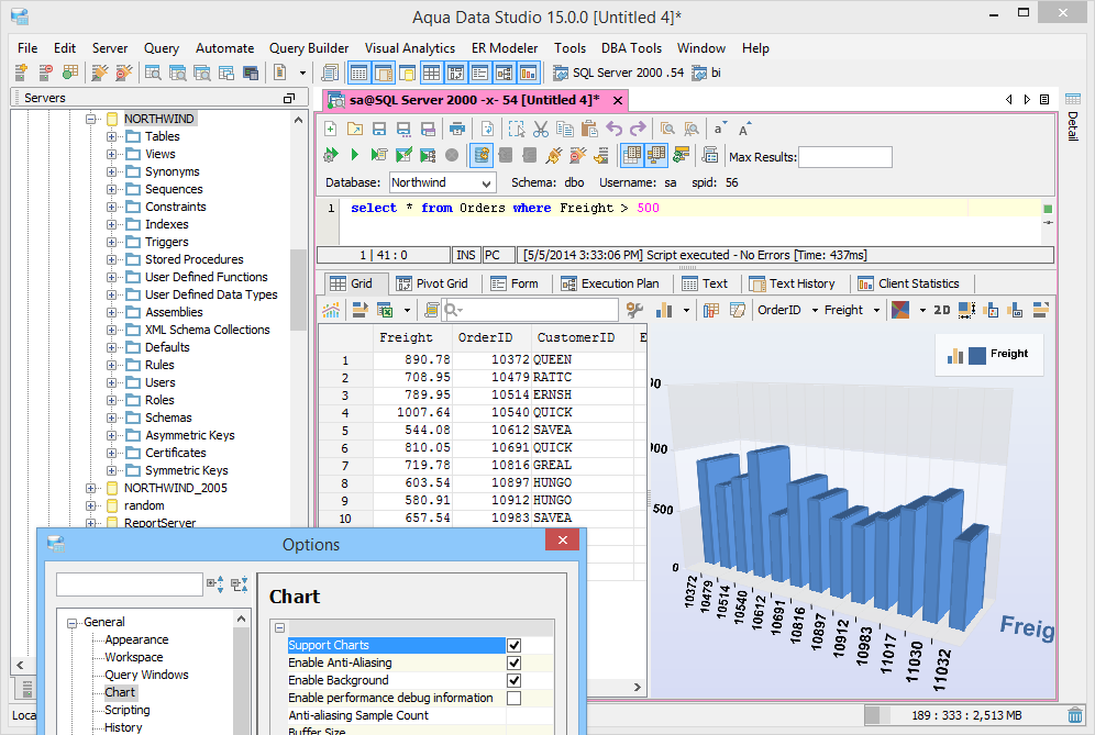
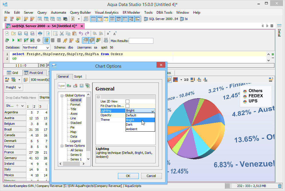
Chart Layouts and Formatting
Users can choose from hundreds of settings to format the Lighting, Opacity, Fonts, Title, Color, Area, Axes, Line types, Legend and other parameters. Display and customize the chart title on your worksheets and dashboards by editing the layout, colors and fonts. Use the Ctrl key and drag with the mouse to position your chart. The View button allows the user to change into any of: Isometric, Category and Series View.
Scaling, Zoom control and 3D Rotation
The Aqua Data Studio Charting Toolkit supports scaling of long charts with huge amounts of data. Another important feature is the ability to allow you to adjust the “zoom” of the chart with the mouse scroll wheel. 3D charts can be rotated to view any display angle.
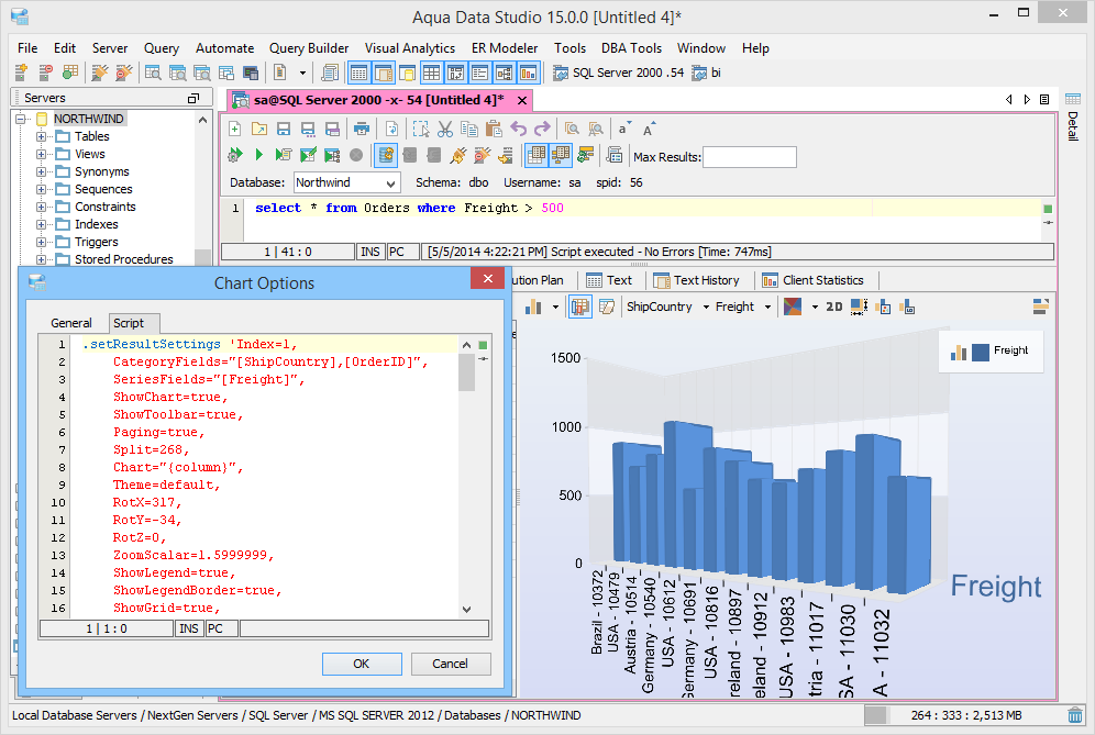
Share and Reuse Aqua Command Scripts for Charts
Aqua Data Studio features a proprietary scripting language called Aqua Commands that contains the source code for the charts created from SQL Queries. An Aqua Command script is generated for every chart and is available under the Chart Options->Scripts tab. This feature allows you to reuse and share chart scripts with your team.
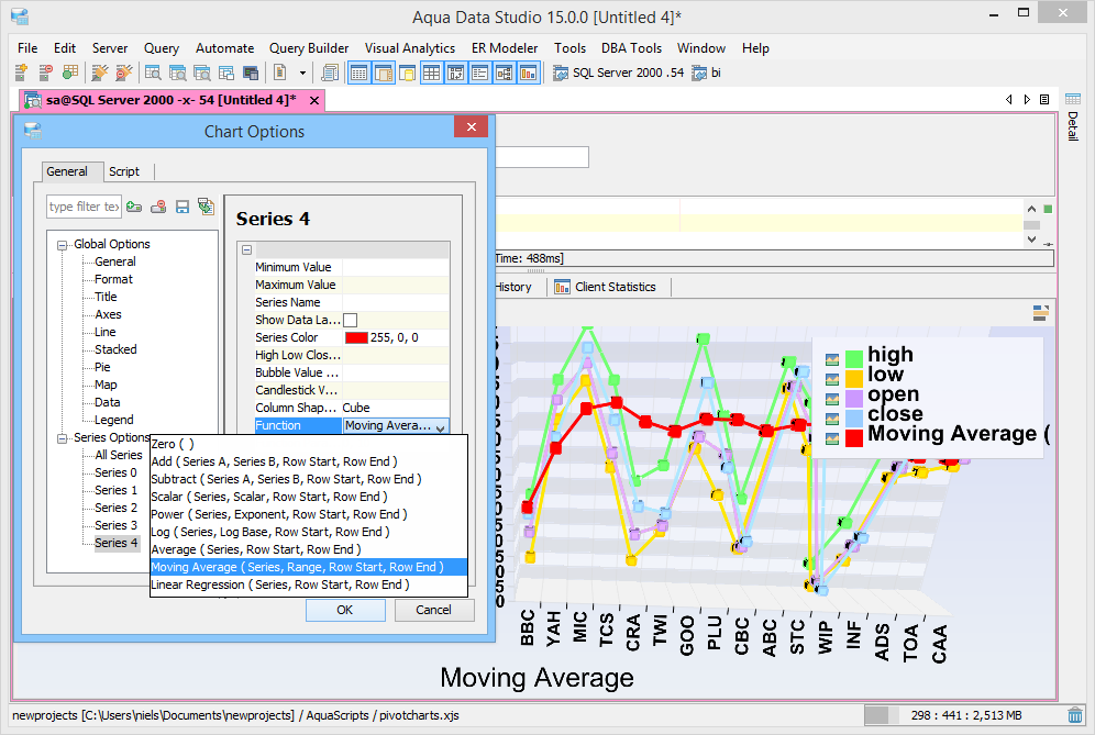
Derived Function Series
Statistical functions such as Scalar, Power, Log, Average, Moving Average and Linear Regression can be applied to Series data in your resultset and rendered as a chart.
Enable Charts in Grid and Pivot Grids
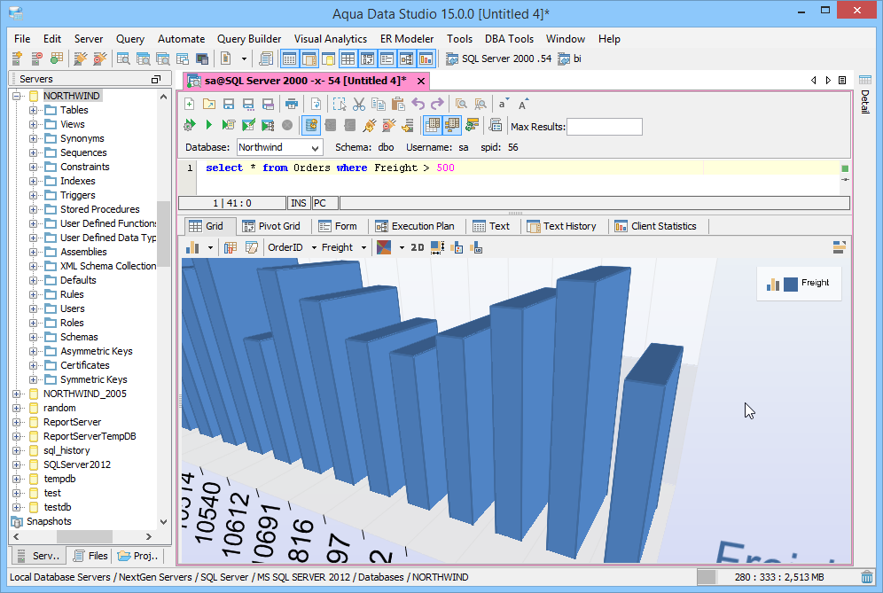
Use the Show Chart button in the Grid and Pivot Grid Results to open the Chart Panel. Aqua Data Studio has a rich set of chart features to select Chart types, Category, Series and Views making your data visualization much easier.
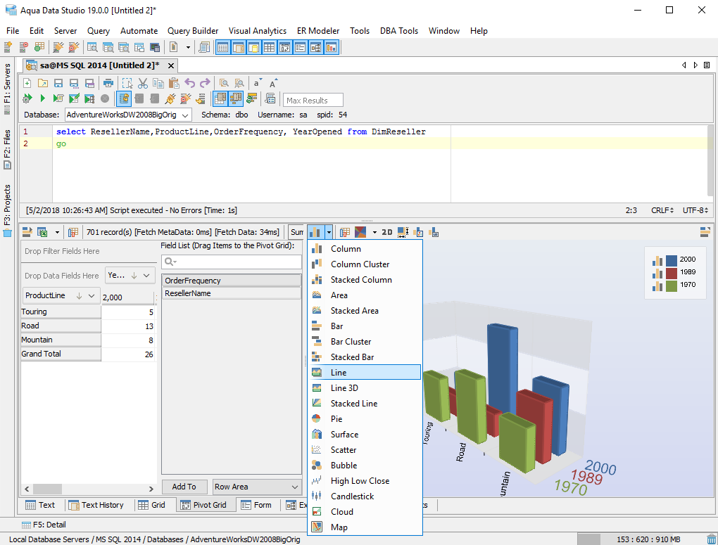
2D and 3D Chart Types
You can render the resultset in the following 2D and 3D Chart types: Column Charts, Stacked Charts, Area Charts, Bar Charts, Pie Charts, Line Charts, Surface Charts, Candlestick, High-Low-Close, Bubble, Scatter Plot Charts, Cloud Charts, Map Charts.
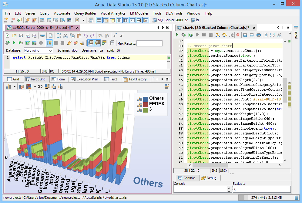
Flexible Pivot Table and Charts
Flexible Pivot Charts can be quickly created based on pivot tables6 by dragging and dropping the available Field List items to data, row and column fields. The Field List also provides access to Field Settings such as how to summarize the data with Aggregate Functions. The Pivot Grid Options button allows you to Show Fields, Show Totals and Show Sub Totals in your chart.
Enhanced User Interactivity
With the rich set of Chart Options available, users can select any of the chart elements they would like to manipulate and create compelling user interfaces to make the process of analyzing data more powerful and intuitive.
Open API for Chart development
The Aqua Open API is a JavaScript based language which exposes the charting functionality of Aqua Data Studio. Open APIs enable developers to write scripts to render graphical representations of datasets that access the Charting Features using the com.aquafold.openapi.chart interface.
Save as Image
Once a SQL Editor is executed and a chart generated, results can be saved as an image file. Right click on the chart to save as a PNG or JPEG file.